Your office isn’t just a place to work; it’s your most powerful, and often most underutilized, employer branding asset.
- Designing an “Instagrammable” office is not about adding gimmicks, but about building a physical narrative that communicates your company’s purpose and values.
- Amenities and aesthetics must be driven by data and ergonomics to ensure they enhance well-being and productivity, rather than becoming costly, unused props.
Recommendation: Shift your perspective from interior decorating to brand architecture. Every design choice, from the reception desk to the coffee machine, should be a deliberate “EVP Touchpoint” that tells a story your ideal candidates want to be a part of.
As a branding director, you’ve meticulously crafted your employer value proposition (EVP). You’ve polished your career page and fine-tuned your social media messaging. Yet, the final, most tangible piece of your brand story is often an afterthought: the office itself. The prevailing wisdom suggests adding a few brand-colored walls, some quirky furniture, and perhaps a ping-pong table to appeal to younger talent. The result is often a generic “cool” office that feels disconnected from the company’s core identity and fails to impress the discerning Gen Z and Millennial candidates you’re trying to attract.
These superficial tactics miss the point entirely. Candidates today, especially top-tier senior hires and purpose-driven Gen Z talent, can spot inauthenticity from a mile away. They aren’t looking for a playground; they’re looking for proof. Proof that your culture of collaboration is real. Proof that you value their well-being. Proof that your company’s mission is more than just a slogan on a wall. But what if the office could stop being a backdrop and start being the story itself? What if, instead of just decorating a space, you could architect a compelling spatial narrative?
This guide reframes office design as a strategic branding function. We will move beyond aesthetics to explore how to create a physical environment that acts as a powerful recruiting tool. We will dissect how to design specific areas to close senior hires, choose amenities that deliver real value, foster genuine connection, and avoid the common traps that prioritize looks over productivity. This is how you build an office that doesn’t just get photographed—it gets shared because it tells a story people are excited about.
This article provides a strategic roadmap for turning your physical workspace into a critical component of your talent acquisition strategy. Explore how each element of your office can be designed with intent to attract, engage, and retain top talent.
Summary: Design an Office That Goes Viral: Your Ultimate Guide to Attracting Top Talent
- Why the Reception Area Is the Most Critical Room for Closing a Senior Hire
- How to Choose Office Amenities (Gym, Nap Pods) That Actually Get Used
- Cafeteria vs. Kitchenette: Which Encourages Cross-Departmental Serendipity?
- The “Cool Office” Trap: When Aesthetics Ruin Ergonomics
- When to Refresh the Office Design: The 5-Year Cycle You Must Plan For
- Why “Remote Options” Are Now More Valued Than Free Office Snacks
- How to Design a Peer-to-Peer Recognition System That Doesn’t Feel Forced
- How to Reduce “App Switching” Fatigue That Wastes 1 Hour Per Employee Daily?
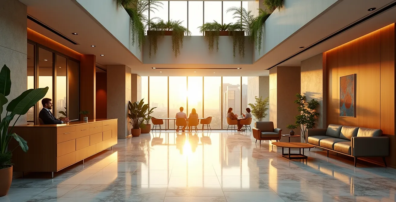
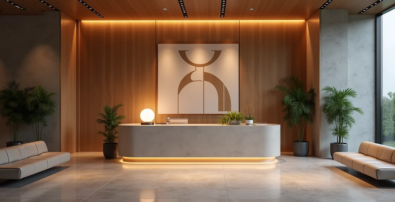
Why the Reception Area Is the Most Critical Room for Closing a Senior Hire
Forget the interview room. The deal with a top-tier senior candidate is often won or lost within the first five minutes of them stepping into your building. The reception area is not a waiting room; it’s the opening chapter of your company’s spatial narrative. For a senior hire, this space answers subconscious but critical questions: Is this company successful? Are they organized? Do they value quality? A flimsy desk, a generic art print, and a wilting plant communicate volumes, and none of it is good. This space must be an exercise in “recruitment funnel staging,” designed to confirm the candidate’s decision to engage with you.
This area should function as a pre-boarding lounge, creating an atmosphere of calm confidence and established success. Think less about overt branding and more about embodying your brand’s essence through materials, lighting, and curated displays. Polished stone, rich textiles, and architectural lighting create a feeling of permanence and quality. Instead of a looping corporate video, consider a subtle, artful display of company milestones or patents—proof of innovation, not just claims of it. This isn’t about extravagance; it’s about intentionality. Every element should reinforce the message that this is a place where serious, impactful work happens.
The goal is to create an environment that feels both impressive and welcoming. A space that makes the candidate feel valued before a single word of the interview is spoken. It’s also your first and best opportunity to create a shareable moment that feels authentic, not forced. This is where the concept of an “Instagrammable office” transcends gimmickry and becomes a strategic asset.
Case Study: LinkedIn’s Strategic Welcome
To make their employer brand tangible, LinkedIn treats its physical spaces as key recruiting tools. For example, at its Silicon Valley headquarters, a vibrant mural is not just decoration. It’s paired with a matching technicolor jacket specifically for selfies, creating a deliberate “EVP Touchpoint.” This simple, physical installation provides a perfect moment for new hires and employees to take a photo and share it, organically broadcasting their pride and affiliation with the company’s vibrant culture across their professional networks.
How to Choose Office Amenities (Gym, Nap Pods) That Actually Get Used
In the arms race for talent, amenities have become a standard offering. The problem? Many companies throw money at trendy perks like nap pods, game rooms, and elaborate gyms without a clear understanding of their actual ROI. An unused nap pod is not an asset; it’s a multi-thousand-dollar monument to a misread culture. To avoid this, your selection process must be data-driven and employee-centric, not based on what looks good in a recruitment brochure. The goal is to provide amenities that genuinely enhance your employees’ work lives, thereby strengthening your employer brand.
The first step is to stop guessing and start measuring. Before investing in any major new amenity, use technology to understand how your current space is utilized. Occupancy sensors and room-booking software can reveal that your team is desperate for more small meeting rooms, not a Zen garden. This data provides a powerful baseline. Next, run pilot programs for potential high-cost amenities. Instead of building a full gym, partner with a local fitness center for a month and track usage. Offer a temporary quiet room with comfortable seating before investing in expensive, futuristic nap pods. This “beta testing” approach allows you to gauge real demand and gather qualitative feedback.
Ultimately, the most valuable amenities are often those that solve a genuine problem or friction point in the workday. This could be a well-designed focus library for deep work, soundproof phone booths for private calls, or simply a high-quality coffee machine that becomes a hub for connection. The key is to align every amenity with your EVP Touchpoints. If you claim to value work-life balance, an on-site errand service or flexible childcare support may be far more impactful than a foosball table. The right amenities are those that your employees will not only use but will also talk about as tangible proof that you care about their well-being.
Cafeteria vs. Kitchenette: Which Encourages Cross-Departmental Serendipity?
One of the most romanticized aspects of office life is the “serendipitous encounter”—the unplanned conversation between an engineer and a marketer by the coffee machine that sparks the next big idea. As a brand architect, your job is to design a stage where this magic can happen. The choice between a large, central cafeteria and smaller, distributed kitchenettes is one of the most critical decisions in fostering this authentic serendipity. It’s a strategic choice that dictates the flow of people and information throughout your organization.
A large, central cafeteria acts as a “town square.” By creating a single destination for food and drink, you force mixing between departments that might otherwise never interact. This model is highly effective at breaking down organizational silos and is particularly efficient for companies with over 100 employees. It maximizes the chances of large-group encounters and broad, company-wide social cohesion. The trade-off is a higher initial investment and a design that must be compelling enough to draw people from all corners of the office.

Distributed kitchenettes, on the other hand, create “neighborhood hubs.” They foster tight-knit, team-level cohesion and are excellent for intimate discussions. This approach is more scalable and can be more cost-effective to implement. However, it risks reinforcing the very silos you want to break. Employees tend to stick to their local watering hole, rarely venturing into other teams’ territories. This can limit the cross-pollination of ideas that drives innovation. A hybrid approach, with a main café supplemented by smaller coffee points, can sometimes offer the best of both worlds, but the central hub must remain the primary social anchor.
As a recent analysis shows, the design of these social spaces has a measurable impact on performance. The data is clear: more amenities correlate with better outcomes, and the cafeteria is often the most important amenity of all. Choosing the right model is a direct investment in your company’s collaborative culture.
| Factor | Central Cafeteria | Distributed Kitchenettes |
|---|---|---|
| Cross-department interaction | High – Forces company-wide mixing | Low – Team-level cohesion only |
| Space efficiency | More efficient for 100+ employees | Better for smaller teams |
| Collaboration style | Spontaneous large-group encounters | Intimate team discussions |
| Implementation cost | Higher initial investment | Lower, scalable investment |
| Allen Curve impact | Overcomes 50m communication barrier | Reinforces departmental silos |
The “Cool Office” Trap: When Aesthetics Ruin Ergonomics
There’s a dangerous trend in office design where aesthetics are pursued at all costs, leading to what can be called the “Cool Office Trap.” This is the office filled with beautiful, sculptural chairs that are impossible to sit in for more than ten minutes, and sleek, minimalist desks with no room for a second monitor. It looks fantastic on Instagram but is a nightmare for employee well-being and productivity. For a generation of talent that prioritizes health and wellness, a workplace that causes physical discomfort is a major red flag. It sends a clear message: we value appearances more than our people.
The antidote to this trap is the principle of Ergonomic Aesthetics. This philosophy dictates that form and function must be inseparable. A chair is not well-designed if it isn’t comfortable. A desk is not well-designed if it isn’t adjustable. This doesn’t mean your office has to look like a sterile orthopedic clinic. The market is filled with furniture that is both beautiful and highly ergonomic. The key is to prioritize function in the selection process. All primary workstations—the places where employees spend the majority of their day—must pass a rigorous ergonomic scorecard before they are even considered for their aesthetic appeal.
This commitment to well-being is not just a moral imperative; it’s a powerful recruiting and retention tool. As recent workplace surveys reveal that 93% of employees value their well-being at work just as much as their pay. An office that is tangibly comfortable and supportive becomes a powerful proof point for your EVP. When candidates tour your space and see adjustable desks, high-quality chairs, and monitor arms at every workstation, you are communicating a deep-seated respect for your employees. This is a far more compelling story than a trendy but uncomfortable lounge area could ever tell.
Your Ergonomic Scorecard: A 5-Point Action Plan
- Survey and Assess: Conduct a thorough survey to understand which amenities and furniture features your employees truly value and use. This insight is a primary driver of their overall experience and well-being.
- Score for Adjustability: Create a scorecard for all potential furniture. Rate each item on critical ergonomic features: height adjustability, lumbar support, armrest positions, and seat depth. No item for a primary workstation should pass without high scores.
- Analyze Lifecycle Cost: Evaluate material durability with a 5-year lifecycle cost analysis. A cheap, stylish chair that needs replacing in two years is a poor investment compared to a durable, ergonomic option with a 10-year warranty.
- Mandate Trial Periods: Before a full rollout, implement a mandatory 30-day trial period for any new standard-issue furniture (like chairs or desks) with a select group of employees. Use their feedback to make the final decision.
- Create Distinct Zones: Intentionally design different zones. Use aesthetic, “look-and-feel” furniture for transient spaces like lobbies and cafes, but mandate high-performance ergonomic furniture for dedicated “sit-and-work” zones.
When to Refresh the Office Design: The 5-Year Cycle You Must Plan For
An office design is not a one-and-done project. It’s a living reflection of your company’s brand, culture, and strategy. Just as you would refresh your brand identity or update your website, your physical workspace requires a strategic refresh cycle to remain relevant and effective. Waiting until the carpet is frayed and the chairs are broken means you’ve already fallen behind. Proactive brand architects plan for a significant refresh every five to seven years, aligning the update with shifts in business goals, team size, and work styles.
The post-pandemic shift to hybrid work has dramatically accelerated the need for this strategic reassessment. The office is no longer just a container for employees; it’s a destination. Its purpose has fundamentally changed, and the design must change with it. Data shows a massive recalibration is underway. A staggering 75% of businesses plan to reduce their office square footage, even as a majority mandate more in-office days. This isn’t a contradiction; it’s a flight to quality. Companies are shedding underutilized, low-value space to reinvest in smaller, more impactful, and highly functional environments.
This creates a powerful opportunity. With a significant number of companies admitting that 40% of their current space is underutilized, a refresh is no longer just about new paint and furniture. It’s a chance to completely rethink your layout to support modern work behaviors. This means reducing rows of identical desks and expanding the footprint of collaborative zones, high-tech meeting rooms, and quiet focus areas. The five-year refresh cycle should be baked into your long-term budget, treated as a critical capital expenditure for maintaining your brand’s vitality and your competitiveness in the talent market. Ignoring it is like trying to recruit top tech talent with a ten-year-old laptop—it signals you’re not invested in the future.
Why “Remote Options” Are Now More Valued Than Free Office Snacks
For years, companies competed on the quality of their in-office perks. Free lunches, gourmet coffee, and endless snacks were the currency of a “great” workplace. That era is definitively over. Today, the single most valued “amenity” isn’t found in the office at all—it’s the option to not be there. Flexibility and remote work options have become non-negotiable for a huge portion of the talent pool. For a branding director, this means the story of your office must now include a compelling narrative about how it supports a hybrid reality.
The office can no longer be the default place for all types of work. It must earn the commute. It needs to become a “destination” with specific offerings that are superior to the home office environment. This requires a strategic shift in design thinking, focusing on what the office can uniquely provide. The most successful hybrid office designs are built around the “Three Cs”: Concentration, Collaboration, and Culture. Instead of a uniform sea of desks, the floor plan is zoned for these distinct activities.
Concentration zones are library-style quiet areas, acoustically treated and governed by a no-meeting policy, for when employees need to escape the distractions of home. Collaboration spaces are high-energy “war rooms” designed for team projects, equipped with writable walls, multiple screens, and flexible furniture that can be reconfigured on the fly. Finally, Culture hubs are the social heart of the office—event spaces, large cafes, and comfortable lounges designed to make the office the central point for team bonding, company-wide events, and celebrating shared successes. By designing for these specific needs, you transform the office from a mandatory location into a valuable resource that employees choose to use.
How to Design a Peer-to-Peer Recognition System That Doesn’t Feel Forced
A positive culture is a core part of any strong employer brand, but simply stating “we have a great culture” is meaningless. Candidates need to see it. One of the most powerful ways to make your culture visible is through peer-to-peer recognition. However, many recognition programs feel corporate, forced, or are buried in a software platform no one uses. The key is to integrate recognition into the physical fabric of your office, turning it into a dynamic and authentic part of your spatial narrative.
The most effective systems are multi-channel, blending digital ease with physical visibility. While a platform like Bonusly or Lattice is great for logging kudos, that recognition dies if it stays on a screen. The solution is to bring it to life. A simple but powerful tactic is to connect your digital recognition feed to large screens in high-traffic common areas like the cafeteria or coffee hub. This creates a constant, ambient stream of positive reinforcement, celebrating successes publicly and reminding everyone of the great work being done.
Beyond digital displays, low-tech, physical touchpoints can feel even more authentic. Consider installing analog “Kudos walls” or large whiteboards in team neighborhoods where employees can leave handwritten notes of appreciation. These become vibrant, evolving testaments to collaboration. These recognition walls are more than just an internal culture tool; they are a prime asset for recruitment. As noted in workplace design strategies, these installations become a key stop on any candidate tour. A guide can point to a wall covered in thank-you notes and say, “This is how our teams support each other.” This is an EVP Touchpoint that provides authentic, peer-generated proof of your collaborative culture, which is infinitely more powerful than any slide in a PowerPoint presentation.
Key Takeaways
- Office as a Narrative: Treat your office design not as decoration, but as the physical storytelling of your employer brand’s purpose, values, and promises.
- Data Over Gimmicks: Base amenity and design choices on actual usage data and employee feedback, not on fleeting trends, to ensure real ROI and enhanced well-being.
- Ergonomics are Non-Negotiable: A beautiful space that is uncomfortable is a failed space. Prioritize ergonomic-first design for all primary workspaces to prove you value your people’s health.
How to Reduce “App Switching” Fatigue That Wastes 1 Hour Per Employee Daily?
In the modern workplace, a significant drain on productivity and well-being doesn’t come from the physical environment, but from the digital one. “App switching” fatigue—the constant toggling between Slack, email, project management tools, and video conferencing—is a major source of cognitive load. While many solutions focus on better software, brand architects can use physical office design to mitigate this digital chaos. The office can become a sanctuary from digital overload by providing analog and focused alternatives.
The core idea is to create physical spaces that are intentionally low-tech or single-purpose. For instance, instead of relying on digital focus-mode apps, design “no-tech zones.” These are library-like spaces where laptops are discouraged, and analog tools like whiteboards and notepads are provided. These areas give employees permission to disconnect and think deeply without the constant barrage of notifications. Research shows this approach can be highly effective at reducing interruptions.
Similarly, physical architecture can solve the friction of digital tools. Instead of employees fumbling with settings for every video call, dedicated, pre-configured Zoom rooms can dramatically speed up meeting start times. Instead of individuals constantly checking digital dashboards, a large physical display in a team area showing key metrics can reduce individual checking and create shared awareness. By creating physical solutions to digital problems, you not only improve efficiency but also send a powerful message about valuing deep work and employee well-being. This is the final frontier of a truly holistic and brand-aligned office design.
| Challenge | Digital Solution | Physical Architecture Solution | Effectiveness |
|---|---|---|---|
| Constant notifications | Focus mode apps | No-tech zones with analog tools | Physical: 85% reduction in interruptions |
| Dashboard checking | Consolidated dashboards | Large physical displays showing metrics | Physical: 60% fewer individual checks |
| Meeting app overload | Calendar consolidation | Dedicated Zoom rooms with pre-configured settings | Physical: 40% faster meeting starts |
| Information overload | AI summaries | Maker spaces and libraries without Wi-Fi | Physical: 2x creativity scores |
Transform your office from a passive cost center into your most active and persuasive recruiting asset. Start by auditing your current spatial narrative and identify the gaps between the brand story you tell and the one your physical space currently lives. Your next star candidate is watching.